
OUTERclé Fornace Brioni + Cristina Celestino: Tivoli Tech in Cielo (Bundle).
From Navy to Obsidian: 10 Best Pool Tile Colors for Striking Impact
Choosing the best pool tile colors for your swim zone can dramatically influence the atmosphere of your entire outdoor space. From deep navy blues to serene teals, color plays a key role in shaping the water’s tone and the environment’s overall mood. Thoughtfully paired color combinations—whether soft and tonal or bold and contrasting—can elevate your design. Additionally, water, tile, and sunlight interact to create striking visual effects.
Let’s look at some pool tile color ideas to see how these elements interact and factor into choosing the right pool tile colors for your space, and dive into expert tips to help your pool tile palette feel intentional and beautifully integrated with its surroundings.
Begin your design journey with our curated collection of pool tiles—crafted for lasting beauty and visual depth.


A Curated Palette: 10 Pool Tile Colors That Transform Outdoor Space
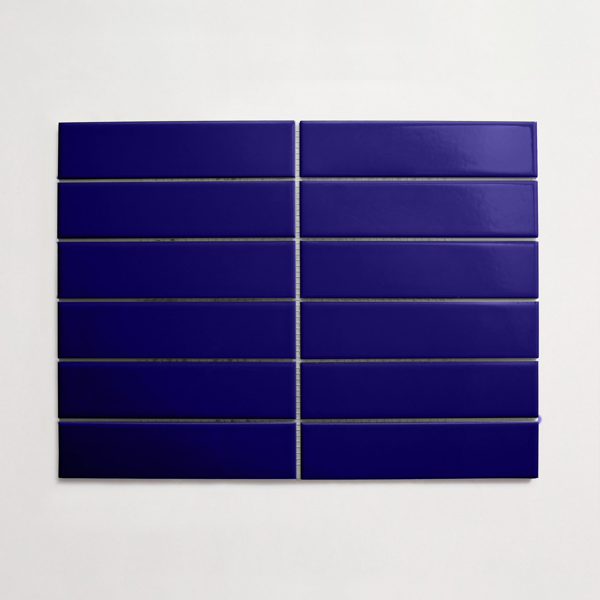
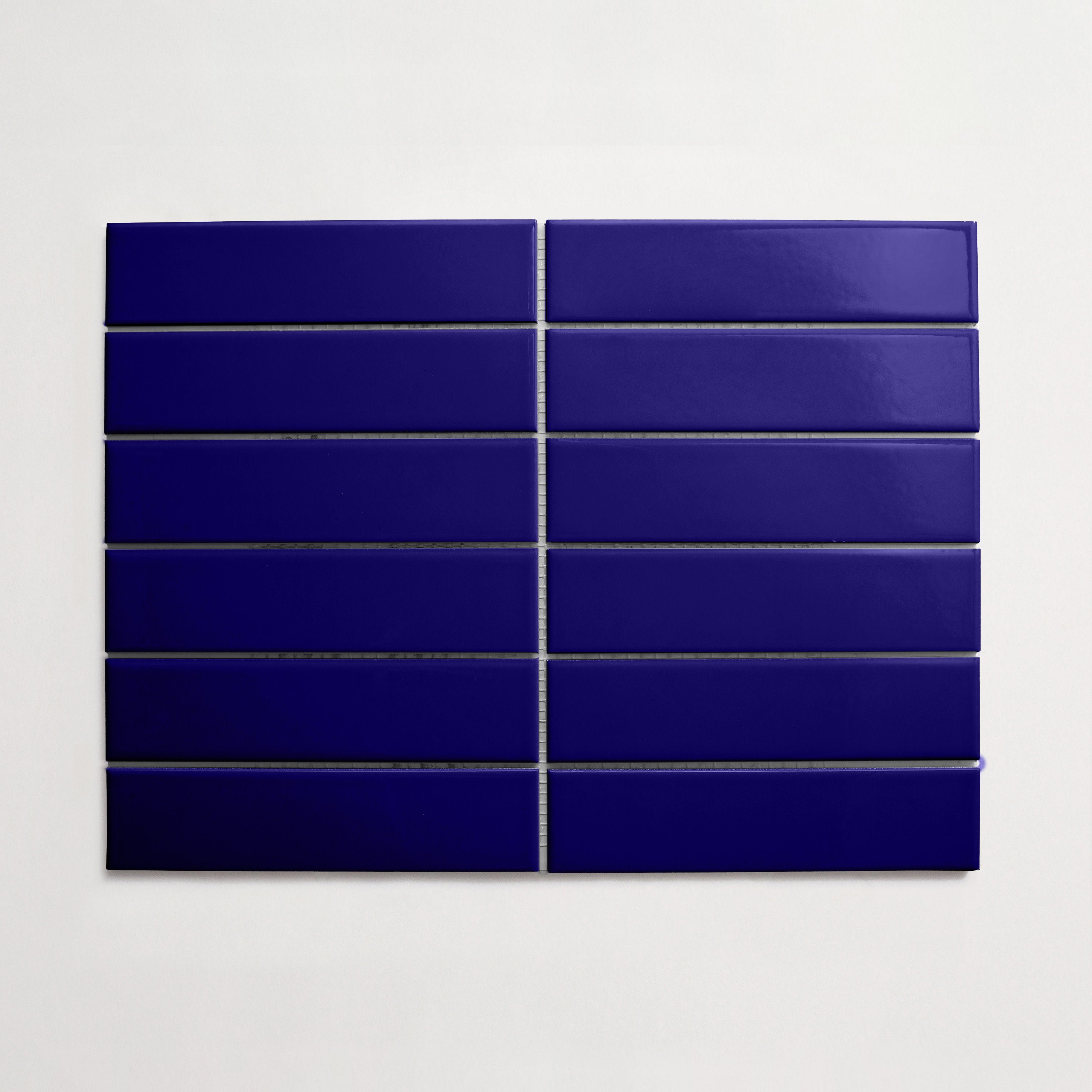
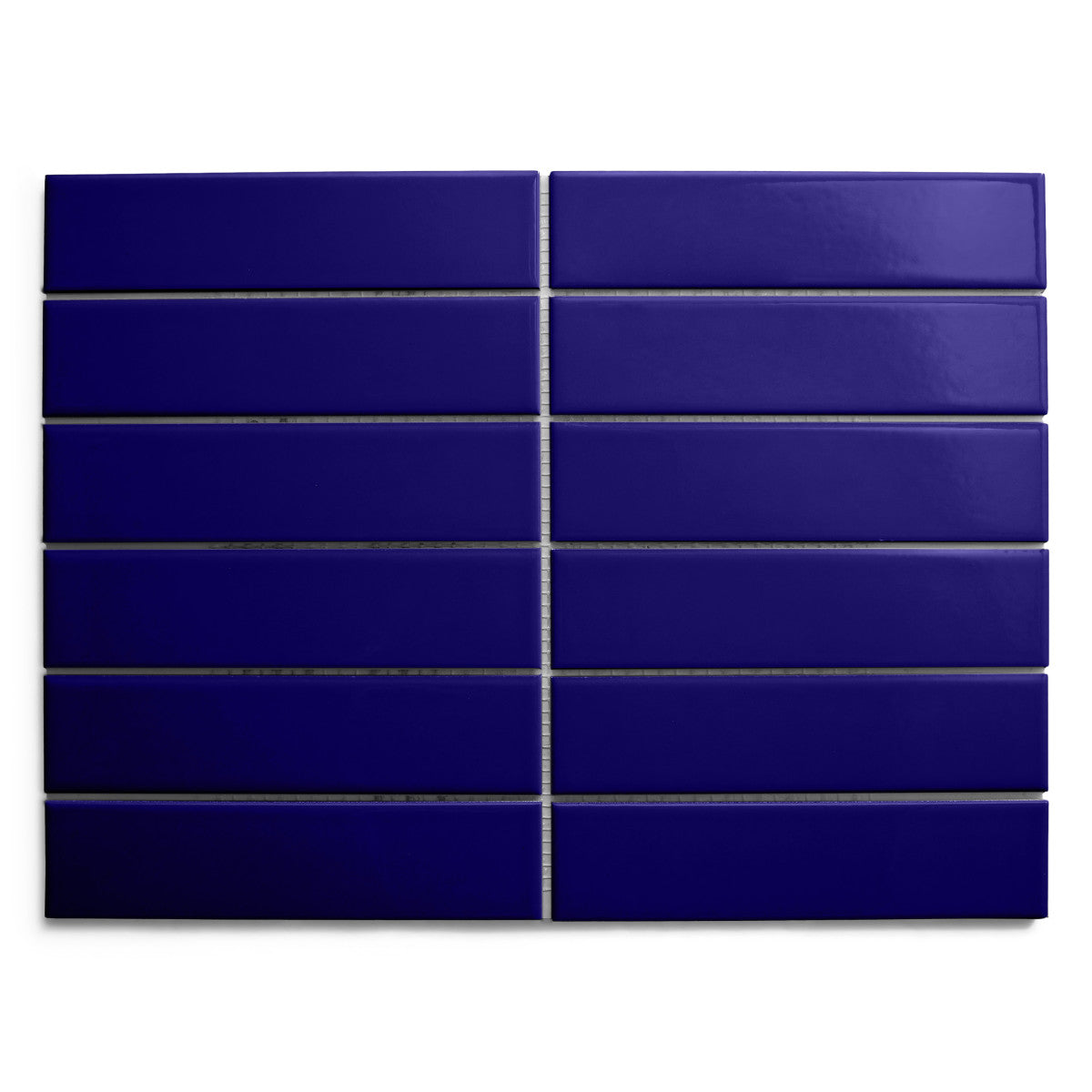
1. Navy
Rich, deep blue tiles are more than just popular pool tile colors—they bring a sense of elegance and tranquility to your pool, echoing the depth of the open sea. This sophisticated hue creates a dramatic contrast against light stone surrounds or lush greenery, instantly elevating the space. As sunlight shifts, the water shimmers with moody undertones, adding visual intrigue.
Darker shades also help conceal debris and maintain a clean look. Whether your style leans classic or contemporary, this bold blue grounds the design with timeless appeal.
2. Obsidian
A onyx-black or charcoal-toned tile brings bold definition to pool design, creating striking reflections and a mirror-like water surface. This dark palette adds depth and drama, especially when paired with minimalist architecture or desert-inspired landscaping. Obsidian-inspired hues lend a sense of modern luxury while amplifying contrast with surrounding textures.
The effect is sleek and serene, with water taking on an inky, glassy quality. These tones also absorb heat, keeping the water warmer on cooler days. Ideal for high-impact design, this choice transforms pools into sculptural focal points.
3. Cobalt Blue
Rich sapphire or deep azure tiles infuse your pool with a timeless, Mediterranean-inspired elegance. These vibrant blues intensify the water’s clarity and shimmer, reflecting sunlight in sparkling, ever-changing patterns.
Perfect for coastal or resort-style backyards, this classic shade feels refreshing and invigorating. It contrasts beautifully with stone or brick pavers, white stucco, or lush greenery. The bold color enhances depth perception, making even shallow areas appear more expansive. Whether in glossy or matte finishes, this hue delivers a bold, yet balanced, aesthetic. For those seeking a clean and energizing palette, cobalt-inspired tones make a striking choice.
Check out these blue waterline tile ideas for more inspiration.
4. Slate Gray
Smoky charcoal or graphite tiles lend a sleek, contemporary edge to your poolscape. These cool, neutral tones evoke a sense of calm and balance, allowing surrounding materials and landscaping to shine. When paired with modern architecture or natural stone, they create a refined, grounded atmosphere.
Their understated elegance works beautifully in both sunny and shaded settings. Depending on light and water depth, they shift from silver to deep gunmetal, adding visual dimension. These shades are ideal for minimalist designs or nature-inspired palettes. Durable and timeless, slate-inspired colors offer subtle drama.
5. Seafoam Green
Soft mint or pale aqua tiles bring a fresh, breezy feel to any pool area, evoking the gentle hues of tropical shallows. These light, calming tones make the water appear clear and inviting, perfect for relaxed, resort-style settings.
When paired with sandy stone, warm wood, or soft landscaping, the look feels natural and easygoing. In bright sun, the color glows with a luminous quality, adding a sense of openness. These gentle greens also pair beautifully with whites, taupes, and brass accents for a refined, beachy vibe. With casual elegance, seafoam-inspired shades create a soothing, sunlit escape.
6. Sandstone Beige
Warm, sun-kissed neutrals like buff bring a natural sophistication to poolside spaces. These soft, earthy tones mirror the look of beachy landscapes and desert stone, creating a seamless transition between water and surrounding patio. Light-colored tiles keep surfaces cool underfoot while enhancing a sense of calm and openness. They also reflect sunlight gently, giving the pool water a crystalline, airy quality.
This palette works beautifully with terracotta, wood accents, and greenery. From a Mediterranean retreat to a minimalist oasis, sandy hues offer timeless appeal and create a grounded yet airy outdoor ambiance.
7. Aqua
Refreshing tones like lagoon or turquoise instantly evoke a sense of escape and relaxation. These luminous hues mirror tropical waters, making even a compact pool feel like a coastal hideaway. Bright yet soothing, they enhance the water’s natural sparkle and amplify light reflection throughout the space. Paired with pale stone or lush greenery, this color choice creates a lively, rejuvenating atmosphere.
Whether used as a full-surface treatment or in accent bands, this palette adds clarity and vibrancy. It’s perfect for those seeking a breezy, uplifting outdoor aesthetic that feels both playful and serene.
8. Charcoal
Deep tones like ash bring a bold, modern edge to your pool design. These rich shades ground the space visually and offer striking contrast against surrounding greenery or pale decking. Their moody depth intensifies the water’s color, creating a mirror-like surface that shifts with light and shadow.
Well-suited for contemporary or minimalist landscapes, these darker tones lend sophistication and drama. When used selectively—on steps, waterlines, or feature walls—they provide definition without overwhelming. They also mask debris better than lighter colors, making them as practical as they are stylish.
9. Ivory White
Soft, sun-washed tones like bone or cream offer a serene and timeless foundation for any poolscape. These pale hues reflect natural light beautifully, giving the water a crystalline, spa-like clarity. They blend seamlessly with stone, wood, or greenery. Their understated elegance invites calm and balance while enhancing the sense of openness.
Subtle warmth in these lighter tones adds a gentle glow at golden hour, elevating the ambiance without overpowering. They’re especially striking when combined with contrasting colors, textured surfaces, or patterned accents, providing a versatile canvas for layered design. (Imagine white tile with dark grout.)
10. Teal
Vibrant shades like deep turquoise or rich blue-green bring a refreshing and dynamic energy to pool designs. Teal tiles create a striking balance between calming blues and invigorating greens, evoking tropical waters and lush landscapes. This lively color enhances sunlight’s sparkle on the water, adding depth and movement.
In eclectic or modern outdoor spaces, teal pairs beautifully with natural wood, stone, or bright accent colors. It energizes the environment while maintaining a soothing, inviting feel. Use it across the entire pool or as a bold accent—teal adds a unique, captivating touch. It’s an excellent choice for those seeking both vibrancy and tranquility.
Explore pool tile options that balance tone, texture, and craftsmanship—each one selected for striking outdoor impact.

Pool Tile Color Combinations with Elevated Impact
Monochromatic Palettes: Depth Through Tone and Finish
Using shades from the same color family creates a layered, sophisticated look that adds dimension. By mixing different tones—light, medium, and dark—and varying finishes like matte, glossy, or textured, you build visual interest and depth. This subtle approach allows your pool to feel cohesive and elegant, with each tile contributing to a harmonious overall effect.
Monochromatic schemes are timeless and versatile, easily complementing any surrounding landscape or architectural style. The play of light on varied surfaces enhances the richness of the design, making the space feel thoughtfully curated and inviting.
High-Contrast Pairings: Drama and Architectural Lines
Bold color contrasts create striking visual drama and emphasize architectural features around your pool. Pairing dark tiles with light ones highlights clean lines and geometric shapes, making your pool design stand out. This dynamic concept draws attention to edges, steps, or borders, adding definition and structure.
High-contrast palettes can feel modern and energetic, giving your outdoor space a vibrant personality. From black and white, to deep navy with bright whites, to rich charcoal against sandy neutrals, these combinations create eye-catching impact. They bring clarity and rhythm to your design, turning the pool area into a bold statement piece, with a powerful and polished look.
Earth Meets Water: Soft Neutrals and Natural Blues
Combining gentle earth tones with cool blues creates a soothing, balanced pool design that feels both grounded and refreshing. Warm beiges, sandy hues, and soft taupes blend effortlessly with serene aquas and gentle navy shades.
This harmonious palette mirrors nature, evoking sandy shores meeting calm waters. It enhances the outdoor environment by connecting pool surfaces to surrounding stone, wood, and greenery. The subtle contrast adds depth, offering a tranquil and inviting atmosphere for those seeking a natural, timeless look that celebrates the meeting of land and water.
How Tile Color, Water, and Light Create Visual Impact
Why Color Perception Changes Underwater
Tile color takes on new character once submerged, as water and sunlight interact to shift how hues appear. Colors often look deeper or more muted underwater, with blues intensifying and warmer tones softening in clarity. The play of ripples and light reflection adds dynamic movement, changing appearance throughout the day.
Even neutral tiles can glow with unexpected richness when lit by the sun. This optical transformation is key to crafting mood and atmosphere. Understanding how your chosen colors will behave beneath the surface helps shape a visually stunning pool environment.
The Role of Sunlight, Shade, and Reflections
The interaction between tile color, natural light, and surrounding elements adds dimension to any pool design.
Bright sun can make light tiles shimmer while casting dramatic highlights on darker surfaces. Shade from trees or structures cools tones and enhances contrast, creating tranquil zones. Reflections from nearby greenery, sky, and architecture further influence how tiles are perceived.
As the light shifts, so does the color story—bringing movement and mood to the water.
How Grout Color Influences the Final Look
Grout color plays a surprisingly powerful role in shaping a pool's visual effect. A closely matched grout blends with tile for a seamless, unified appearance, while a contrasting shade outlines each tile, adding definition and rhythm. Light and water amplify these differences, especially under shifting conditions.
Whether you want bold geometry or a soft, fluid feel, grout selection helps steer the design's overall tone and visual harmony.


The Importance of Finish: Texture, Tone, and Safety
Glossy vs. Matte: What Each Reveals and Conceals
Finish matters as much as color when selecting pool tile, influencing both aesthetics and functionality.
Glossy tiles reflect more light, enhancing shimmer and depth but can also reveal water spots or wear more easily. Matte finishes offer a softer, more natural appearance while reducing glare and providing added grip—especially important for safety in wet zones.
The choice between the two impacts how your space feels and performs over time.
Textured Surfaces and Slip-Resistant Design
Surface texture plays a key role in both the look and safety of your pool area. Tiles with subtle ridges, patterns, or tactile variation not only add visual interest but also help prevent slips and falls, especially in splash-prone zones.
These textures contribute to a more grounded, organic feel, blending functionality with design. Prioritizing grip-friendly surfaces ensures beauty doesn’t come at the cost of safety.
Using Finish to Enhance or Soften Color
The finish of pool tile can dramatically influence how color is experienced in your outdoor space. A glossy surface amplifies brightness and makes hues appear more saturated, while a matte or honed finish tends to mute bold tones and introduce a softer, more natural feel. Finish adds subtle nuance to the palette, shaping how tiles interact with water and light. It’s a quiet tool for refining visual balance.
Bringing It All Together: Tips for a Cohesive Design
Curated Combinations to Consider
Achieving a unified pool tile design starts with intentional pairings that speak the same visual language. Blend complementary shades across field tiles, borders, and accents to create rhythm. Vary tone or finish for depth while keeping within a consistent palette. Look to nature, architecture, or even textiles for inspiration—layering colors and textures that feel balanced from every angle.
The Role of Landscape and Architecture
To create a pool tile design that feels naturally integrated, take cues from your home’s architectural features and the surrounding landscape. Let the tones of nearby stonework, wood, or stucco influence your tile palette. Echo the organic shapes or clean lines of your exterior to maintain flow.
When tile choices resonate with their environment, the entire space feels more intentional, grounded, and visually connected.
Sampling, Mock-Ups, and Professional Guidance
It’s a good idea to test ideas in context. Gather samples to see how colors and textures interact with natural light, water, and nearby materials. Create small mock-ups or mood boards to visualize the overall effect. Consulting with a design professional can offer insights you might miss, ensuring your choices align with both function and aesthetic for a compatible outdoor retreat.
Choosing the right pool tile colors, thoughtful color combinations, and purposeful finishes can dramatically elevate your outdoor space. From serene neutrals to bold blues, the hues you select—along with their texture and sheen—shape how your pool looks and feels. By considering how color, water, and light interact, and aligning your tile choices with your landscape and lifestyle, you can create a cohesive design that’s both beautiful and functional.
Reimagine your poolscape—explore our pool tile collection to find the color, texture, and finish that brings your vision to life.
Colorway
-
Cobalt Cloche
Collection
-
Colorwerks
:
Sub Collection
-
Alegria
Material
Length
-
4
" x
Width
-
4
" x
Thickness
-
¼
"
Unit of Measurement
-
sqft
/
Price per Unit
$

Colorway
-
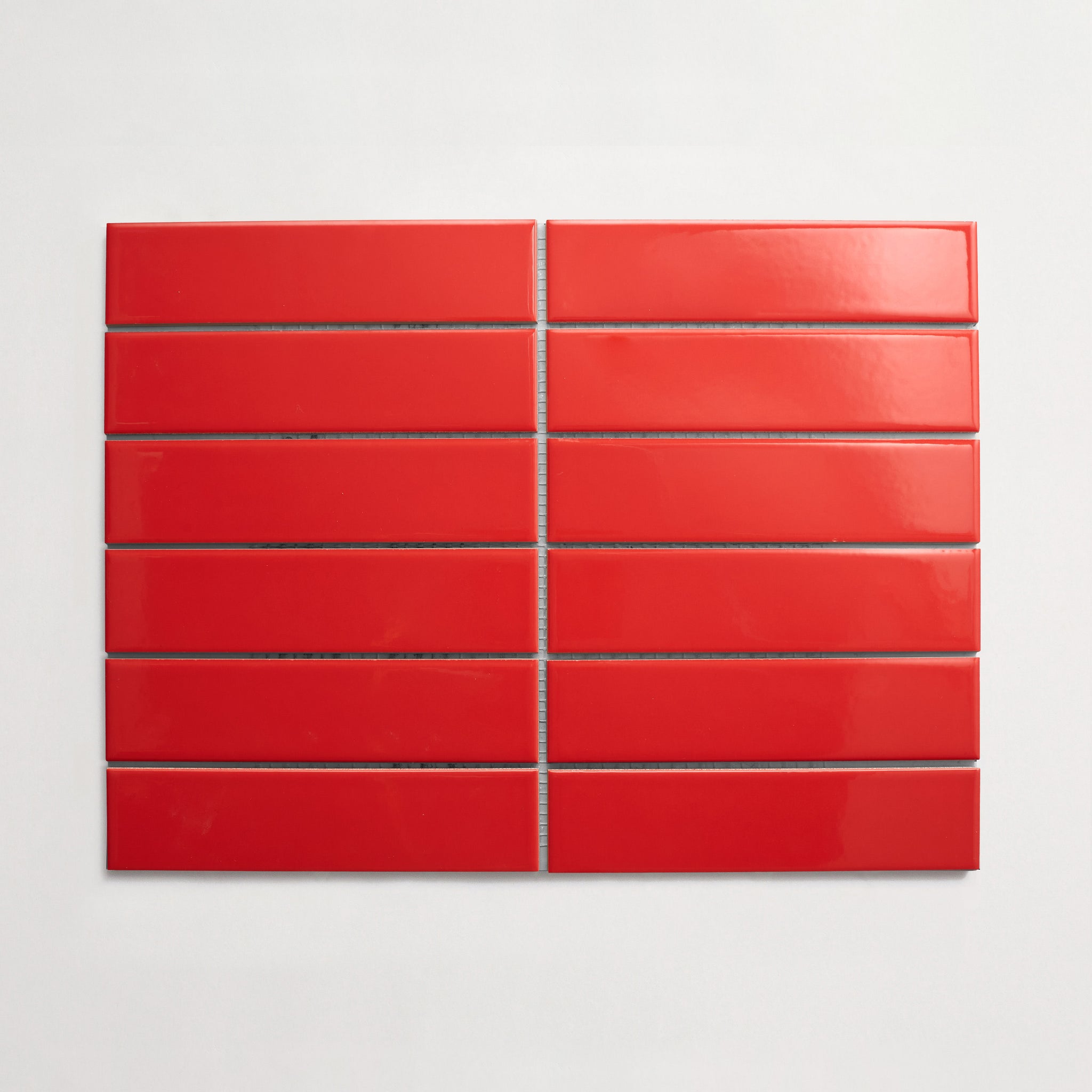
Rosalind Red
Collection
-
Colorwerks
:
Sub Collection
-
Alegria
Material
Length
-
8
" x
Width
-
8
" x
Thickness
-
⅞
"
Unit of Measurement
-
sqft
/
Price per Unit
$
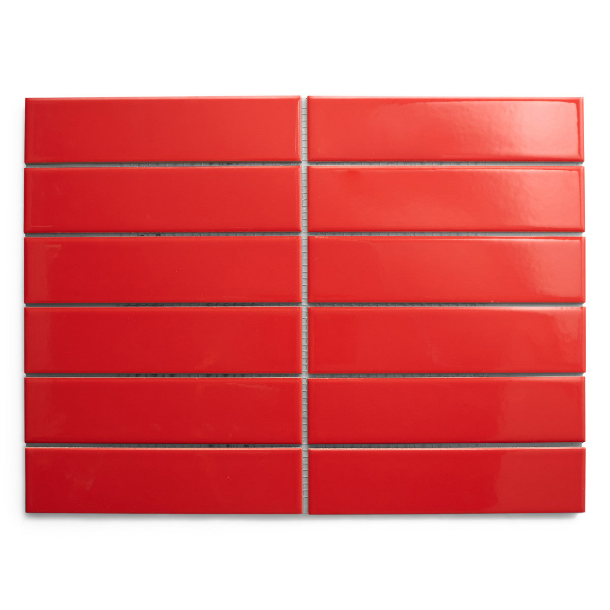
Colorway
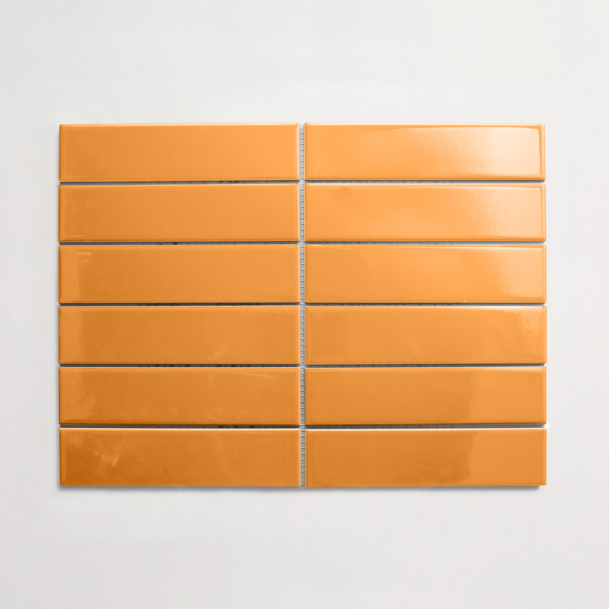
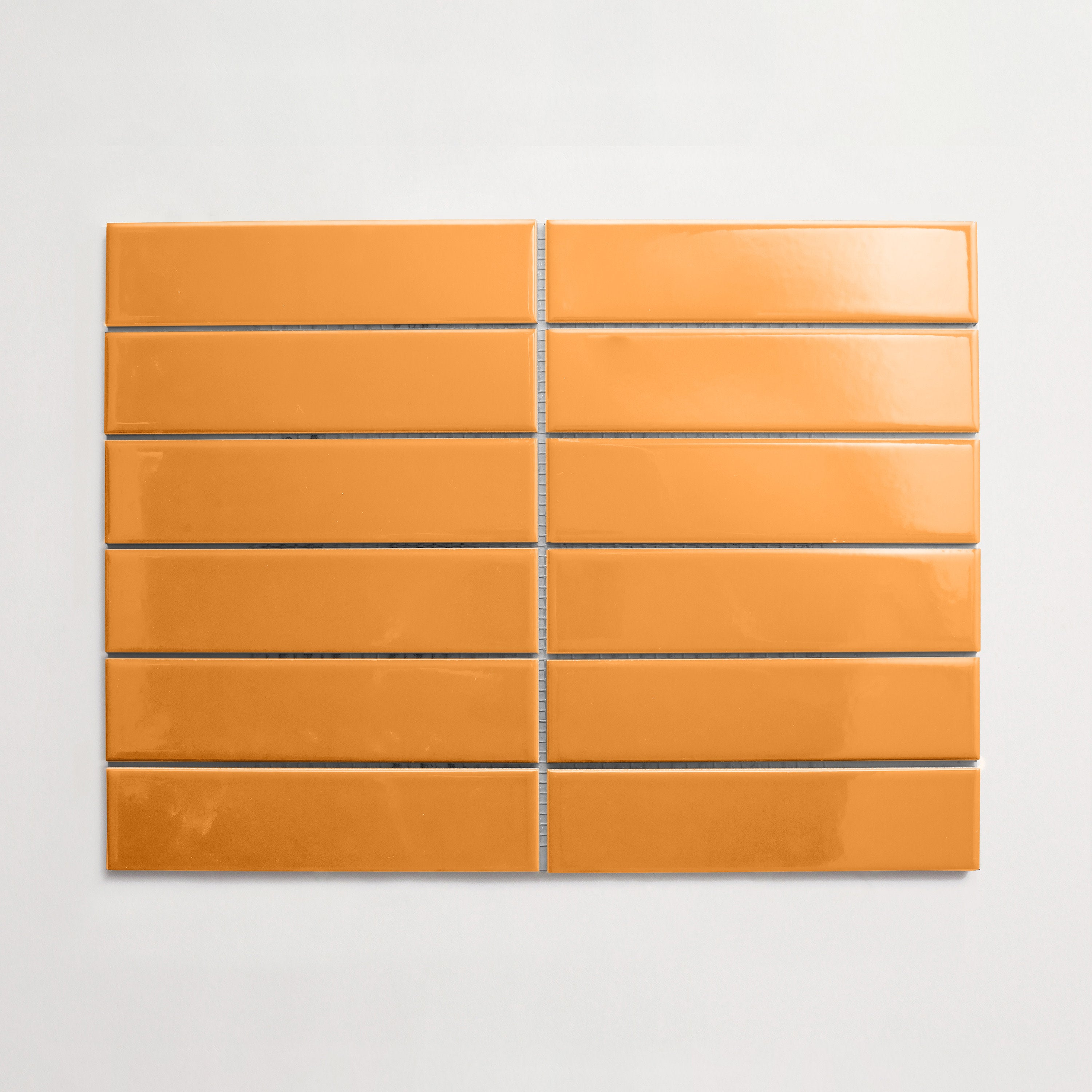
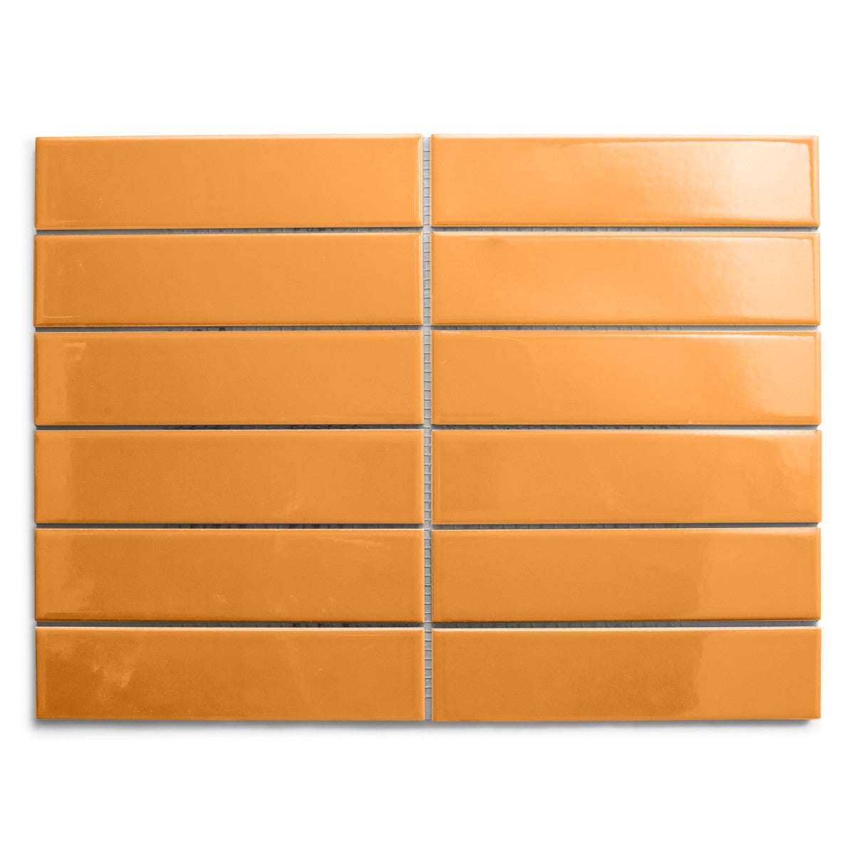
-
Satsuma Peel
Collection
-
Colorwerks
:
Sub Collection
-
Alegria
Material
Length
-
4
" x
Width
-
16
" x
Thickness
-
¾
"
Unit of Measurement
-
sqft
/
Price per Unit
$