
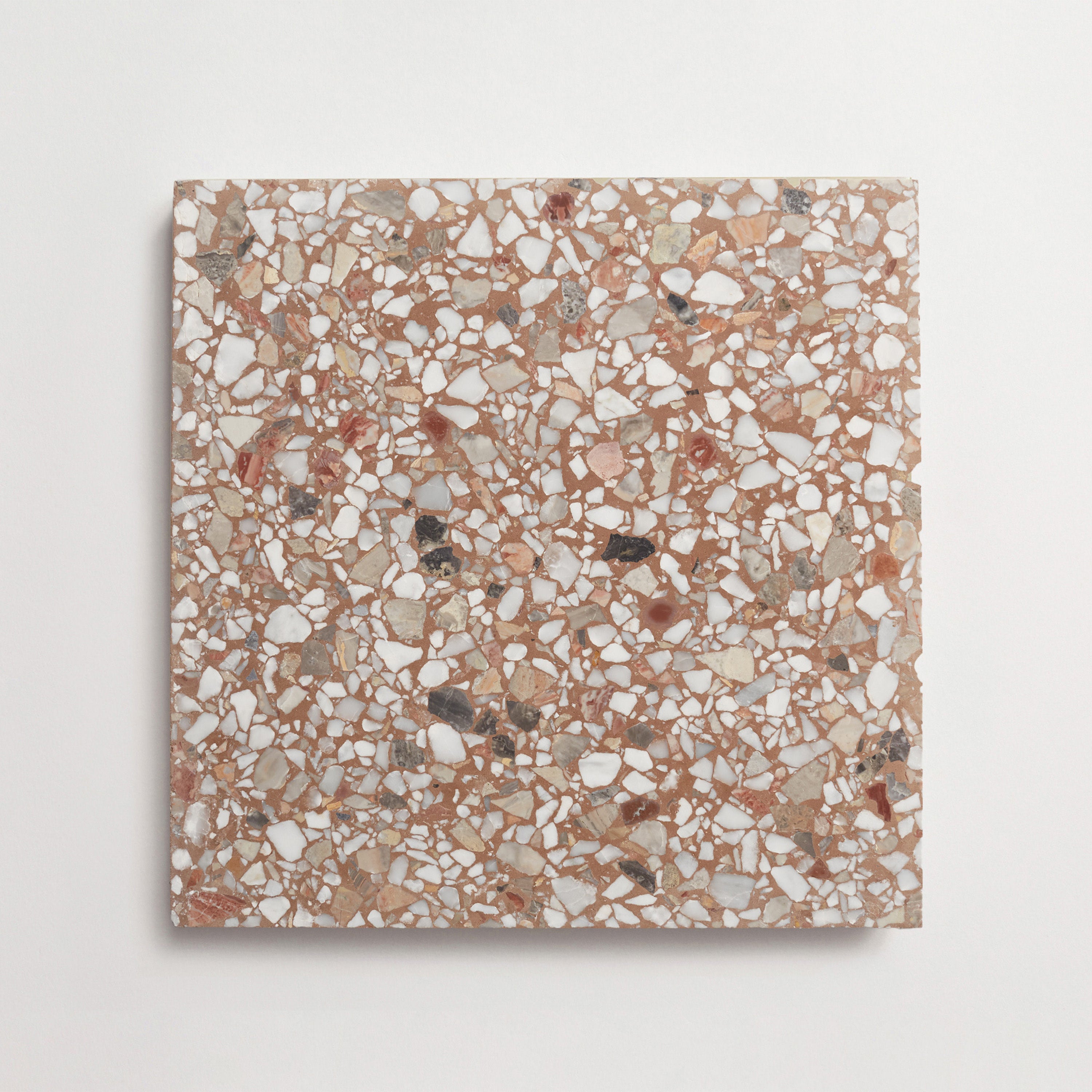
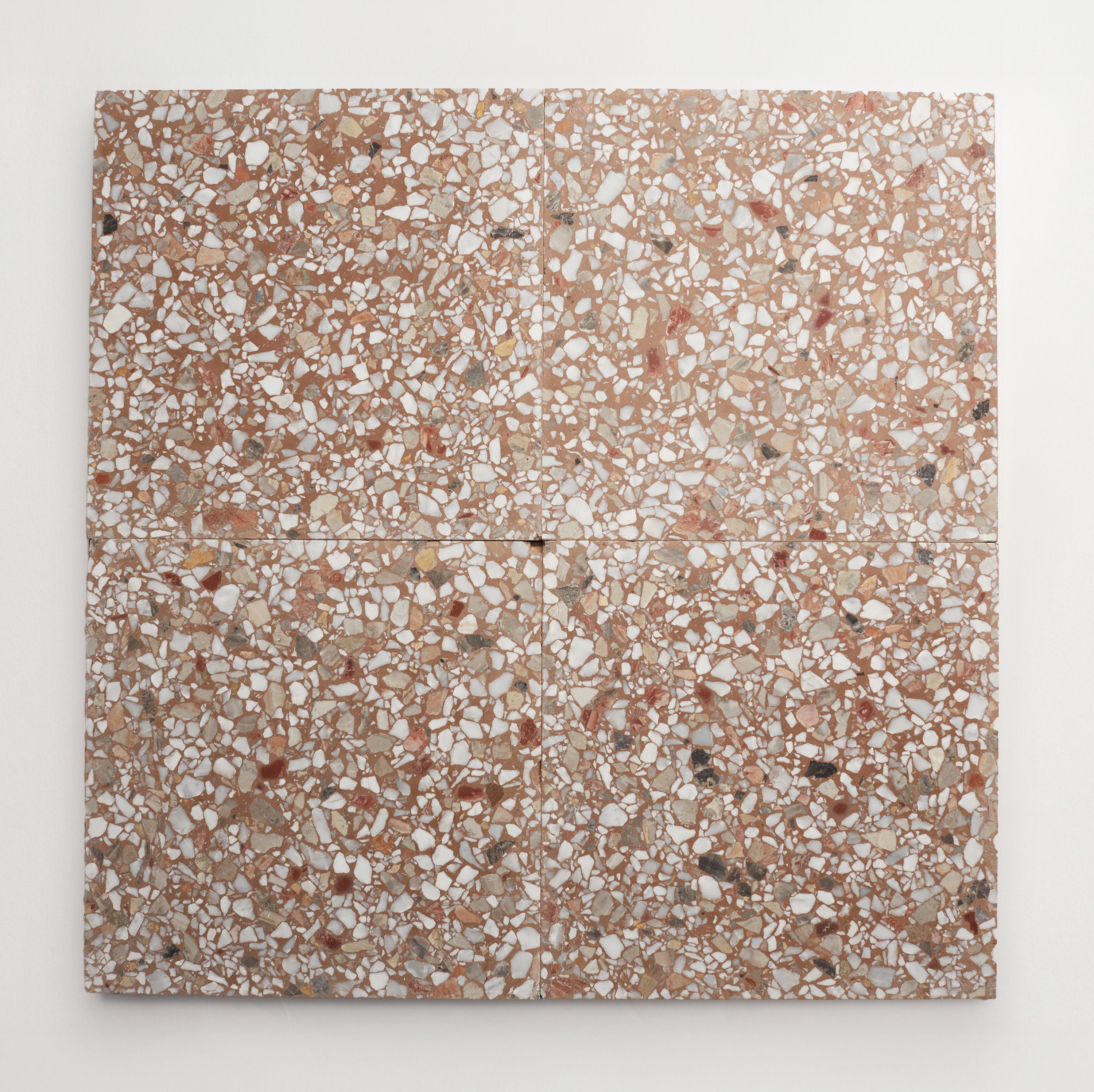
OUTERclé BrickWorks Collection
How to Choose Paver Colors for Timeless Outdoor Elegance
Color has a quiet but powerful way of shaping how a landscape feels — and how it’s remembered. When you begin thinking about how to choose paver colors, you’re not just selecting a surface; you’re setting the tone for the entire project. The right color can unify architecture and landscape, soften transitions, and create a sense of permanence.
As all landscape architects and designers know, thoughtful color selection considers harmony with the home, the surrounding environment, and the intended mood of the space. Warm tones can echo natural materials and invite relaxation, while cooler shades create a more contemporary, tailored look. Climate also plays a role, both visually and functionally, influencing how colors age and perform over time.
Ultimately, choosing paver tones is about balance. It’s about finding a palette that feels grounded yet refined, expressive yet enduring — one that evolves beautifully over time.


Match Paver Colors to the Home’s Architecture
If you’re unsure how to choose exterior paver colors, start with your (or your client’s) home’s architectural palette. Pavers should feel like a natural extension of the structure rather than an afterthought. Look closely at siding, brick, roofing, and trim to identify undertones. Homes with warm red or brown brick often pair beautifully with soft grey or charcoal pavers. Meanwhile, cooler-toned homes with slate roofs or blue-grey siding benefit from crisp greys or even pale limestone hues.
For traditional homes, brick pavers in warm earth tones can reinforce a sense of heritage and continuity. In more contemporary projects, cement pavers in neutral shades offer a clean, architectural finish. The goal isn’t exact matching, but cohesion. Try to echo undertones while introducing just enough variation to create depth.
When done well, the right color ties the entire project together, making the outdoor space feel both integrated and timeless.
Consider Landscape and Natural Surroundings
Beyond the home itself, the surrounding landscape plays an equally important role in choosing paver tones. Gardens, trees, and natural features create a living backdrop, and your paver colors and styles should respond to that environment rather than compete with it. Earthy tones like sandy beiges, muted browns, and soft taupes blend seamlessly with greenery, creating a grounded, organic feel that evolves beautifully with the seasons.
Neutral paver colors are often considered the best choice for long-term versatility. They allow planting schemes to change over time while maintaining a consistent foundation. Natural stone pavers are especially effective here, as their subtle variations mirror the textures found in nature.
That said, contrast can be equally powerful when used intentionally. Lighter pavers can define walkways against lush planting, while darker tones can frame patios or seating areas. The key is balance. Use color to highlight spatial design while maintaining a cohesive palette across the entire project.

Paver Colors by Application and Climate
When selecting pavers for an outdoor space, it's important to consider how color impacts their application, the local climate, and the overall mood you intend to set. Here are a few things to think about for patios, pool decks, warm climates, and beyond.
Patios and Walkways
Patios and walkways are where material and color meet daily use. These areas benefit from tones that feel inviting yet practical. Mid-range neutrals like warm greys, soft taupes, and muted beiges are the perfect choice because they hide dirt and wear while maintaining a refined appearance.
Mixing paver colors can also introduce subtle variation, adding visual interest without overwhelming the design. This is especially effective in larger patios, where a single flat color may feel too expansive. By blending tones, you create movement and texture underfoot.
For walkways, slightly lighter or contrasting tones can help improve visibility and safety. Whether using brick pavers for a classic look or more contemporary options from a cement collection, the goal is continuity. A well-considered patio or path feels intuitive and connected to the rest of the landscape.
Pool Decks and Driveways
Pool decks and driveways demand a slightly different approach to color selection, balancing aesthetics with performance. For pool paver colors, lighter tones are often the best choice. They reflect sunlight, helping surfaces stay cooler underfoot — an essential consideration in warm climates. Soft creams, pale greys, and sandy hues create a relaxed, resort-like atmosphere while remaining comfortable to walk on.
Driveways, on the other hand, benefit from slightly darker or more variegated tones. These shades help conceal tire marks, stains, and daily wear, making them a practical and visually consistent option. Charcoal blends, warm browns, and mixed-tone pavers offer durability without sacrificing style.
Both applications benefit from subtle color variation. Blended tones or lightly textured finishes create dimension and help surfaces age gracefully. Whether designing a poolside retreat or a welcoming entry drive, the right color enhances both function and visual appeal.
Climate Impact
Climate has a quiet but significant influence on how paver colors perform over time. In warmer regions, lighter shades are a good choice because they reflect heat and remain more comfortable underfoot. This is particularly important for pool deck pavers and patio pavers, where direct sun exposure can intensify heat retention.
In cooler climates, darker tones can be equally effective. They absorb warmth and help snow melt more quickly, making them a practical paver color for driveways and walkways. That said, it’s important to balance function with aesthetics. Overly dark surfaces may feel heavy if not offset with lighter architectural elements.
Moisture and weathering also affect color perception. Natural stone pavers, for example, tend to deepen in tone when wet, adding richness and variation. Choosing paver tones that account for these shifts ensures the design will remain cohesive year-round.
Color Psychology and Mood
Color does more than define a surface — it shapes how a space feels. When considering how to choose paver colors, it’s worth thinking about the emotional tone you want to create. Warm, earthy hues like terracotta, sand, and soft brown evoke comfort and intimacy, making them a perfect choice for gathering spaces like patios and courtyards.
Cooler tones, such as slate grey or pale stone, lean toward a more modern and minimalist aesthetic. These shades create a sense of calm and clarity, often used in contemporary designs where clean lines and open space take center stage.
Blended color palettes add another layer of depth. They introduce movement and subtle complexity, making large areas feel more dynamic and less uniform. This approach works especially well in expansive outdoor spaces where a single tone might feel too static.
Ultimately, the right color supports the intended mood, whether that’s relaxed and organic or structured and refined.


Popular Paver Color Palettes
As you begin the process of choosing paver colors, understanding the most popular palettes can provide a helpful starting point. Here are just a few of them.
Neutral Greys and Beiges
Neutral greys and beiges remain one of the best choices in paver colors for a reason: They are endlessly versatile. These tones act as a quiet backdrop, allowing architectural features and landscaping to take the spotlight. Whether used in a modern courtyard or a traditional garden path, they adapt effortlessly to a variety of design styles.
A soft grey palette can lean contemporary, especially when paired with clean lines and minimalist planting. Meanwhile, warmer beige tones bring a subtle softness that feels welcoming and timeless. This flexibility makes neutral pavers a perfect choice for projects where longevity and adaptability are key.
Blending these neutral tones can also add depth. Slight variations in color create texture and interest, ensuring the surface feels dynamic rather than flat. For designers seeking a cohesive yet understated foundation, neutral greys and beiges are consistently a solid choice across a wide range of outdoor environments.
Earthy Browns and Terracottas
Earthy browns and terracotta tones offer a richness that feels deeply connected to the landscape. These colors echo natural materials like clay and soil, making them an excellent choice for projects that prioritize warmth and authenticity. Brick pavers often fall into this category, bringing a sense of history and craftsmanship to outdoor spaces.
Terracotta hues, in particular, create a sun-warmed effect that feels inviting and relaxed. They pair beautifully with lush greenery, enhancing the vibrancy of plants while grounding the overall design. Deeper browns, on the other hand, provide contrast and structure, helping define edges and transitions within the landscape.
These tones are especially effective in traditional or Mediterranean-inspired settings, but they can also be used in more contemporary designs when balanced with cleaner lines. As part of a thoughtful color selection, earthy palettes deliver both character and longevity.
Bold Charcoals and Creams
For a more dramatic approach to choosing paver tones, bold contrasts like charcoal and cream create a striking visual statement. This palette plays with light and shadow, using variation to define spaces and highlight architectural features. Charcoal pavers bring depth and sophistication, while lighter creams offer balance and brightness.
When used together, these colors can create dynamic patterns or zoning effects within a landscape. A charcoal border around a lighter patio can frame the space beautifully, for example, adding a sense of intention and structure.
Despite their boldness, these combinations can still feel refined when executed thoughtfully. The key is proportion and using contrast strategically. For projects seeking a more contemporary edge, incorporating patterned pavers with a bold palette is an excellent choice.
Trending Color Blends
Blending paver colors is increasingly popular for its ability to create depth and texture. Rather than relying on a single tone, these palettes combine multiple hues — often within the same paver — to achieve a layered and natural look. This approach works particularly well with natural stone pavers and cement pavers, which already have inherent variation.
Color blends can soften transitions between different areas of a landscape, making the overall design feel more cohesive. They also help disguise wear and weathering, as variations in tone naturally conceal imperfections over time.
From subtle mixes of grey and beige to richer combinations of brown and charcoal, the possibilities are wide-ranging. These blends are a solid choice for projects that aim to feel both curated and organic. By embracing variation, designers can create outdoor spaces that feel dynamic, nuanced, and effortlessly timeless.

OUTERclé Paver Inspirations
Our approach emphasizes craftsmanship, variation, and a deep connection to natural textures. We offer collections that elevate both material and color. Pemberley Pavers and BrickWorks are two shining examples: Each collection is designed to support thoughtful color selection, making it easier to achieve a cohesive and enduring palette.
From softly tumbled finishes to richly toned brick pavers, these materials provide a range of options for different project styles. Whether you’re designing a courtyard, pathway, or expansive pool deck, you’ll find textural surfaces that evolve beautifully over time.
Pemberley Pavers: Tumbled Elegance
Pemberley Pavers bring a sense of understated sophistication through their gently tumbled finish and nuanced color range. These pavers are designed to feel aged and natural, making them a perfect choice for courtyards and pathways that aim to evoke timeless elegance.
Shale tones offer a soft, cool grey with subtle variation, ideal for projects that need to have a refined base. Cigar hues, on the other hand, introduce a warmer and richer brown that feels grounded and inviting. Both options work beautifully when blended, creating a layered effect that enhances depth and texture.
This collection is particularly well-suited for spaces that prioritize continuity with the surrounding landscape. The variation in tone ensures that surfaces feel dynamic rather than uniform, while the tumbled edges soften transitions between pavers. Pemberley Pavers deliver a balance of character and restraint, making them a solid choice for elevated outdoor design.
BrickWorks: Rustic Warmth
The BrickWorks collection captures the enduring appeal of traditional brick pavers while introducing a refined, design-forward palette. These pavers bring warmth and texture to outdoor spaces, making them an excellent choice for pathways, courtyards, and garden edges.
Antelope Canyon is a warm, sunbaked hue with subtle orange undertones, reminiscent of natural clay formations. It adds vibrancy without feeling overpowering, creating a welcoming and grounded atmosphere. Sequoia Grove, by contrast, is deeper and more subdued — a rich, earthy tone that introduces depth and contrast.
Together, these colors can be used to create layered, visually interesting surfaces that feel both rustic and intentional. The slight variation in each paver enhances the overall texture, giving spaces a weathered charm that improves with age. Ultimately, the BrickWorks collection balances tradition with timeless outdoor elegance.


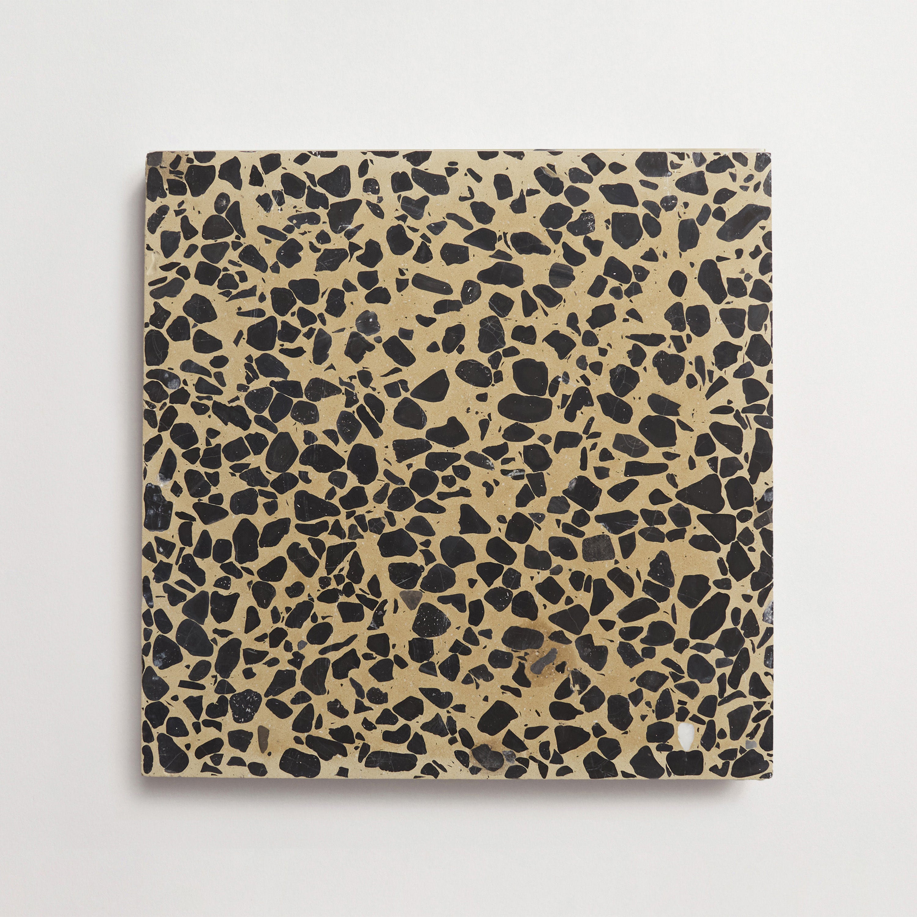
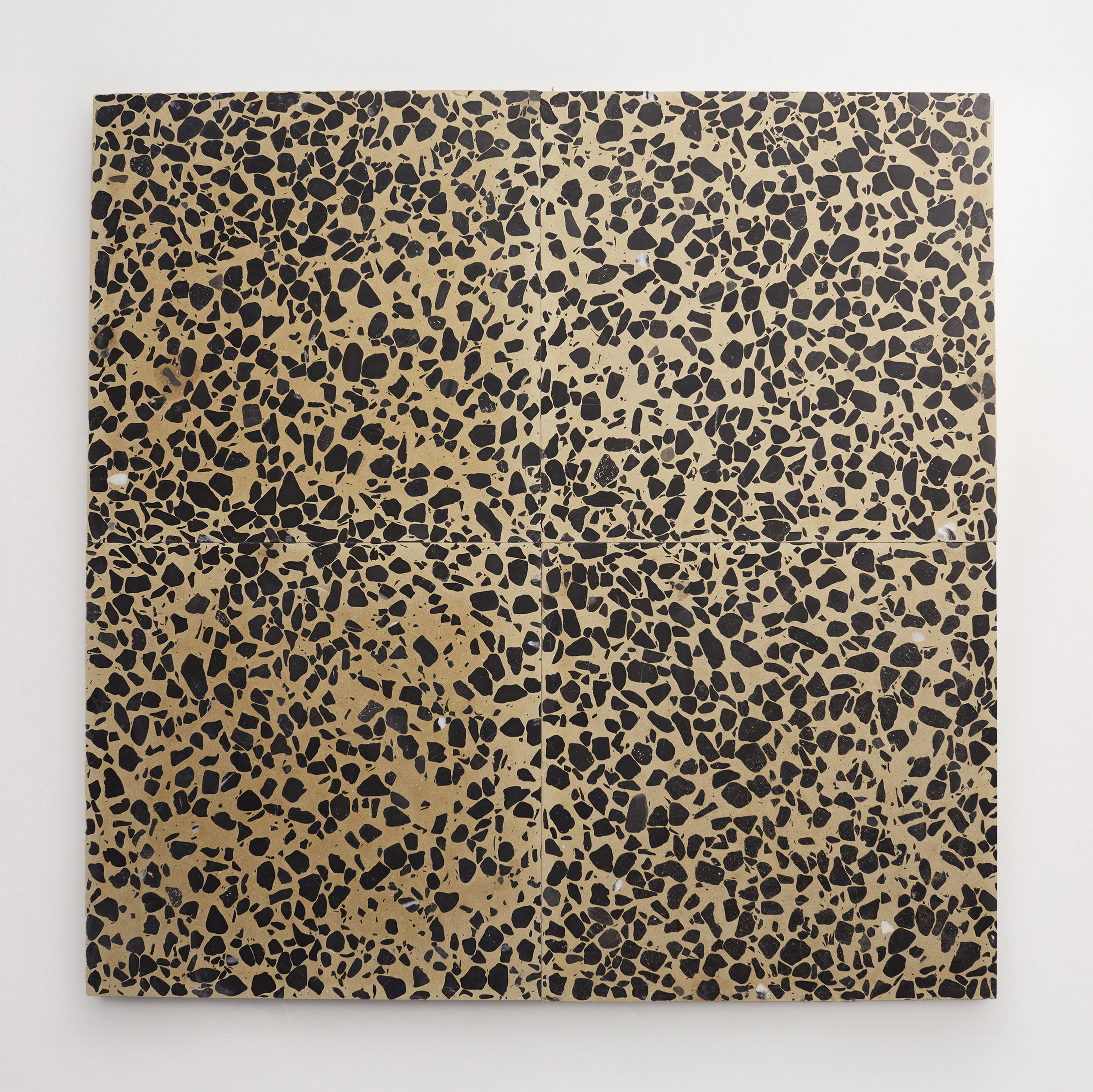

Colorway
-
Fungo
Collection
-
Dolce Vita Terrazzo
:
Sub Collection
-
Torrone I


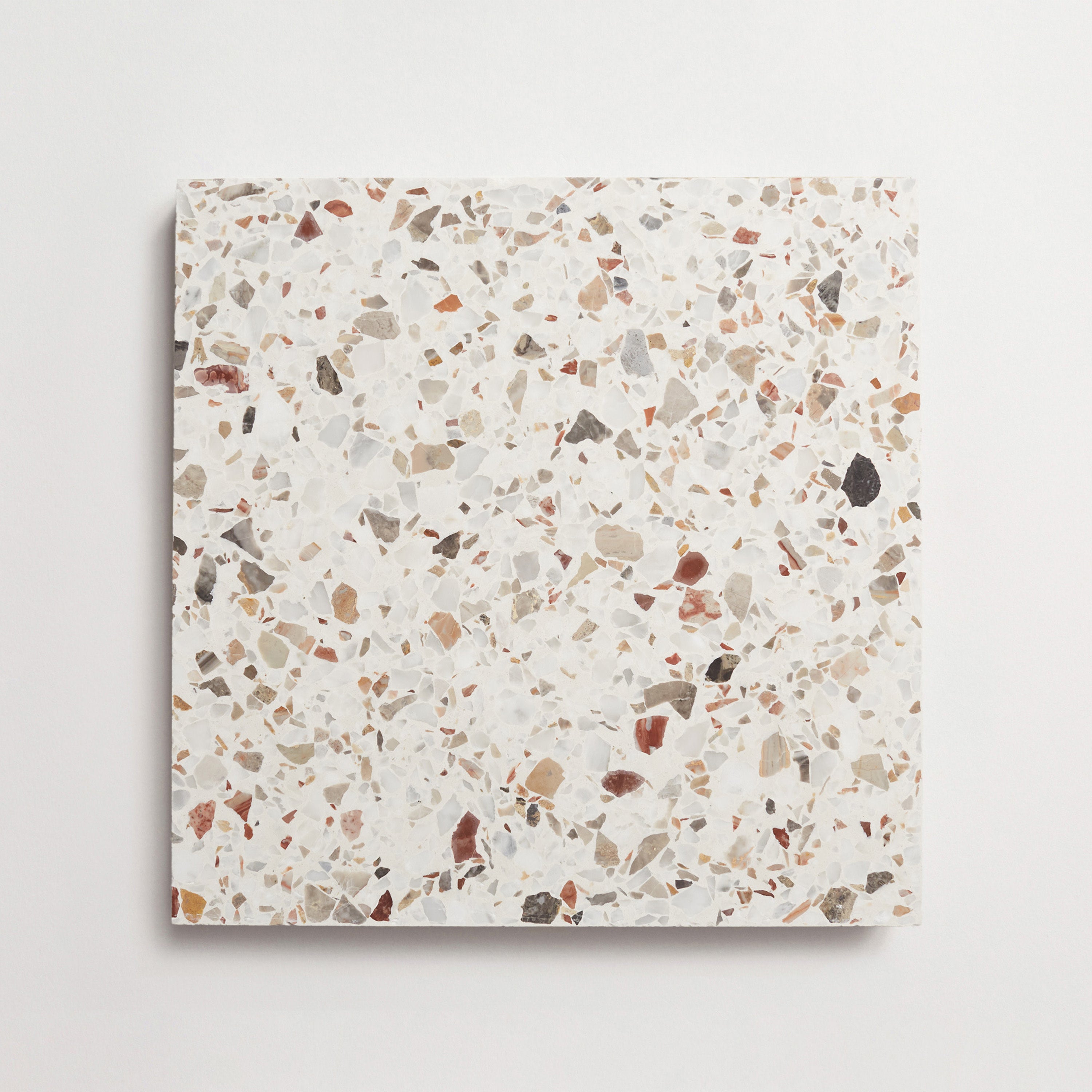

Colorway
-
Blanco
Collection
-
Dolce Vita Terrazzo
:
Sub Collection
-
Torrone II


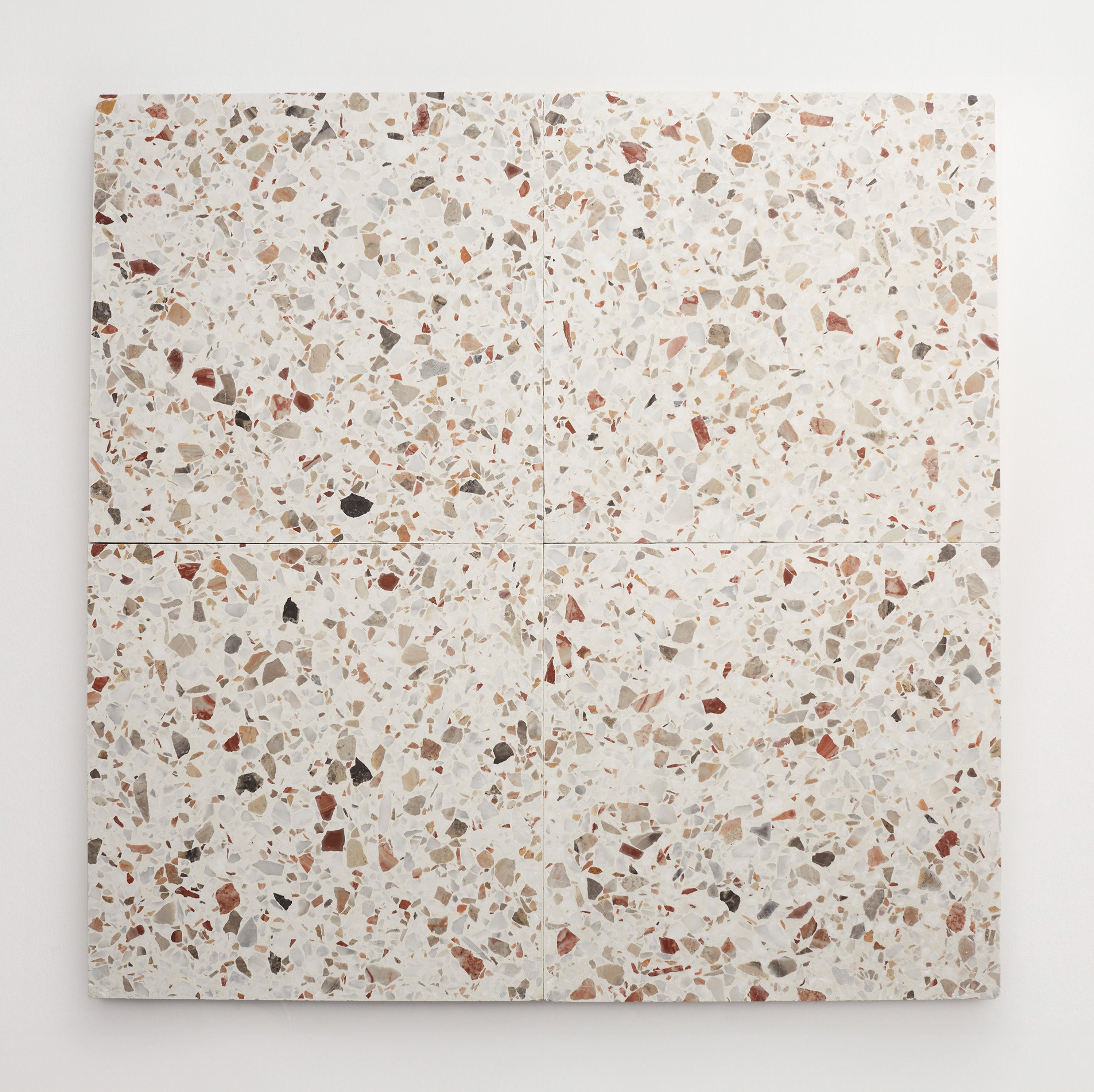
Colorway
-
Maronne
Collection
-
Dolce Vita Terrazzo
:
Sub Collection
-
Torrone II