Explore more at clé: free shipping through 6.29

Lido, ½x½" Confetti, Gloss. Photo courtesy of Charlota Blunarova.
Find Your Aesthetic: Pool Coping Colors That Set the Tone
For interior designers and landscape architects, coping is more than a finishing touch — it’s an essential element that unites the pool deck, outdoor aesthetics, and surrounding landscape. And selecting the right pool coping colors plays a key role in transforming the pool area.
Whether you specify sleek cement coping or certain travertine pool coping colors, understanding how color palette choices interact with materials, textures, and environmental conditions is key. In this article, we explore ten inspiring coping schemes and guide you through selecting the perfect hue for your project.


10 Pool Coping Color Palette Ideas for Every Vibe
When specifying pool coping material and color, consider both form and function. From non‑slip surface requirements to weather resistance and compatibility with the rest of the pool, each option offers unique benefits. Below, we showcase ten color palette ideas, each designed to set a distinct tone, enhance landscape integration, and elevate modern pool design.
Ready to transform an outdoor space? Explore our curated Poolside Collection to find materials that elevate every design aesthetic.
1. Mediterranean Warmth in Sunlit Ivory & Sand
Drawing on Mediterranean villas, this color palette blends sunlit ivory with warm sand tones. It’s ideal for projects that feature natural stone or travertine pool coping colors. It also evokes visions of sun‑baked coastal towns (always a good thing in our book). A subtle bullnose edge in light beige can help unify pool deck paving and waterline tile. This combination feels inviting underfoot and softens any glare, while the warm neutrals harmonize with olive trees, terracotta accents, and citrus‑toned foliage.
2. Minimalist Calm in Charcoal & Cream
For a modern pool design approach, pair deep charcoal coping with crisp cream accents on the pool deck. Beveled edge concrete or cement coping in charcoal can create clean lines, while cream‑colored paver coping on adjacent terraces can balance the drama. This high‑contrast palette suits minimalist architecture, in particular, reinforcing geometry and spaces. The non‑slip surface also ensures safety without compromising the refined aesthetic.
3. Grounded Earthy Hues That Anchor in Quiet Beauty
Earthy tones such as muted terracotta, taupe, and gentle greige work seamlessly with paver coping, cantilevered coping, and other types of coping. These grounded hues complement clay‑based pool deck tiles and other weather‑resistant materials like terracotta tile. They also happen to draw inspiration from rural vistas, integrating effortlessly with gravel gardens, native grasses, and other eclectic touches. This palette emphasizes tactile harmony, giving the pool area serene and timeless appeal.

4. Breezy Blues & Salt-Kissed Grays That Evoke the Sea
Channel coastal vibes with a palette that pairs soft slate grays with drifting sea blues. Porcelain tile coping in pale gray can bring an understated elegance, while a bullnose edge detail in muted blue can accentuate the water’s hue. This combination resonates with oceanfront properties, especially, blending tools like cantilevered coping to create overhangs that cast soft shadows. Be sure to use matte and textured finishes for a naturally non‑slip surface (a must in this frequently wet area).
5. Rusted Reds & Sunbaked Beiges to Echo Arid Landscapes
Drawing on desert landscapes, rusted reds and sunbaked beiges bring warmth and contrast to limestone, travertine, and other natural stone pool coping. A honed finish in beige offers weather resistance (when properly sealed, that is) and helps refine the bullnose edge. Accent this coping with rust‑toned pavers or another type of textured tile on the pool deck. These hues resonate with adobe architecture and sandy surroundings, creating a cohesive dialogue between materials and environment.
Design with intention. Discover artisan tile selections in our Swim Collection — curated for beauty, performance, and enduring style.
6. Whispered Nutrals for Muted Elegance
A refined blend of whisper‑quiet neutrals, soft taupe, pale mushroom, and light greige offer understated elegance when combined into one palette. Incorporate cement coping in a muted tone alongside porcelain coping slabs to deliver a touch of polish. Adding a subtle beveled edge can soften the transition and invite touch as well. This combination suits projects that emphasize minimalism and timelessness. With this approach, simplicity lends sophistication and integrates seamlessly with the surrounding landscape.

FezBrick, 1x8" Amulet, Natural, Unfinished. Photo courtesy of Kajetan Powolny.

7. Slate, Pine & Charcoal Tones Inspired by Alpine Landscapes
Alpine‑inspired palettes combine cool slate gray with deep pine green and charcoal accents. Concrete, cement, or slate coping in charcoal (or even black) anchors the scheme, while pine‑toned paver coping on the pool deck brings a forest‑inspired twist. Natural stone tile on nearby seating walls and a non‑slip textured finish can also help echo rugged mountain terrain. This palette is perfect for properties that are set against wooded backdrops, as well as retreats that are located in cool climates.
8. Bold Tropicals to Infuse Your Pool with Energy
For a vibrant statement, consider pairing saturated teal or turquoise coping with bright coral or chartreuse paver accents. (And these are just a couple ways to opt for bold tropical colors.) Porcelain coping in a bold hue contrasts brilliantly with a neutral pool deck in light travertine or brick. The vivid palette complements tropical planting schemes, palm fronds, and flowering shrubs especially well.
Elevated coping materials are able to offer a non‑slip surface and weather resistance, even when you’re specifying bold pigments in high‑UV environments. This is especially important if you are considering cement tile for the pool deck.
9. Steel & Stone for a Modern, Urban Retreat
Urban projects call for a sleek palette of steel gray and polished stone. Dark gray tiled coping or natural stone in a cooler shade provides an industrial edge, while light gray limestone paver coping can balance hardness with warmth. Cantilevered coping, in particular, creates floating edges that seem to hover. This refined combination highlights architectural forms, pairs well with clean‑lined furniture, and aligns seamlessly with modern residential pool design.
10. Weathered Tones That Speak of History & Heritage
Weathered, patina‑inspired hues — soft rust, moss green, and aged gray, for example — are ideal for heritage properties and adaptive‑reuse sites. Travertine or natural stone coping in muted earth tones pairs beautifully with reclaimed brick paver coping. A bullnose edge styled to show gentle wear can reinforce the narrative of time. This palette underscores authenticity, linking the pool to the broader context of the surrounding historic architecture and landscape.

Finding the Perfect Pool Coping Color for Your Space
Choosing the right coping color involves more than aesthetics. Interior designers, landscape architects, and homeowners must weigh functional considerations like texture, material performance, and long‑term durability. Below, we explore key factors that influence the success of your pool deck and coping selections.
The Role of Texture & Finish
Texture and finish directly impact both the safety and style of pool coping. A honed or brushed finish on natural stone coping provides essential grip for a non‑slip surface, especially when wet. Polished finishes, on the other hand may appear luxurious — but they can be slippery. Consider matte-grip textured porcelain coping for a crisp, refined look that maintains skid resistance. You could also opt for mosaic pool tile, which calls for more grouting (which means more traction) thanks to its smaller size. Matching the texture across cantilevered coping and paver coping can also ensure consistency underfoot.
Considering Tile Materials
Material choice dictates both coping color and what maintenance will look like. Natural stone surfaces such as travertine, for instance, offer variegated patterns that enhance color depth. Meanwhile, porcelain coping provides uniform tones and superior stain resistance. Concrete coping, on the other hand, gives flexibility in hue and form, which is helpful when opting for beveled edge profiles and cantilevered slabs. Finally, paver coping can introduce modularity, enabling designers to intersperse color variations and integrate with the surrounding landscape and hardscape.
How Colors Hold Up Over Time
Exposure to sun, chlorine, and pool chemicals can alter coping colors over seasons, so keep this in mind as you weigh your options. UV‑stable pigments in modern pool design materials ensure hue retention, while weather‑resistant sealers protect materials like natural stone from fading. Lighter tones reflect heat and minimize thermal stress, whereas darker palettes may require UV inhibitors to prevent discoloration. Always specify finishes that have been tested for weather resistance to maintain the integrity of your chosen color palette.
Selecting the ideal pool coping colors is a nuanced process that balances design vision with practical performance. By exploring diverse palettes — from Mediterranean warmth to urban steel and stone — you can tailor the aesthetic to your project’s context, architecture, and landscape. Remember to consider material properties like weather resistance, non‑slip texture, and color longevity, as well. With thoughtful palette choices and attention to detail, you’ll create a cohesive pool environment that stands the test of time.
Each design tells a story. Complete yours with artisan tile from our Poolside and Swim collections — crafted to reflect your unique outdoor vision.


Colorway
-
Sand
Collection
-
Pemberley Pavers
:
Sub Collection
-
Granita
Material
Length
-
4
" x
Width
-
4
" x
Thickness
-
¼
"
Unit of Measurement
-
sqft
/
Price per Unit
$


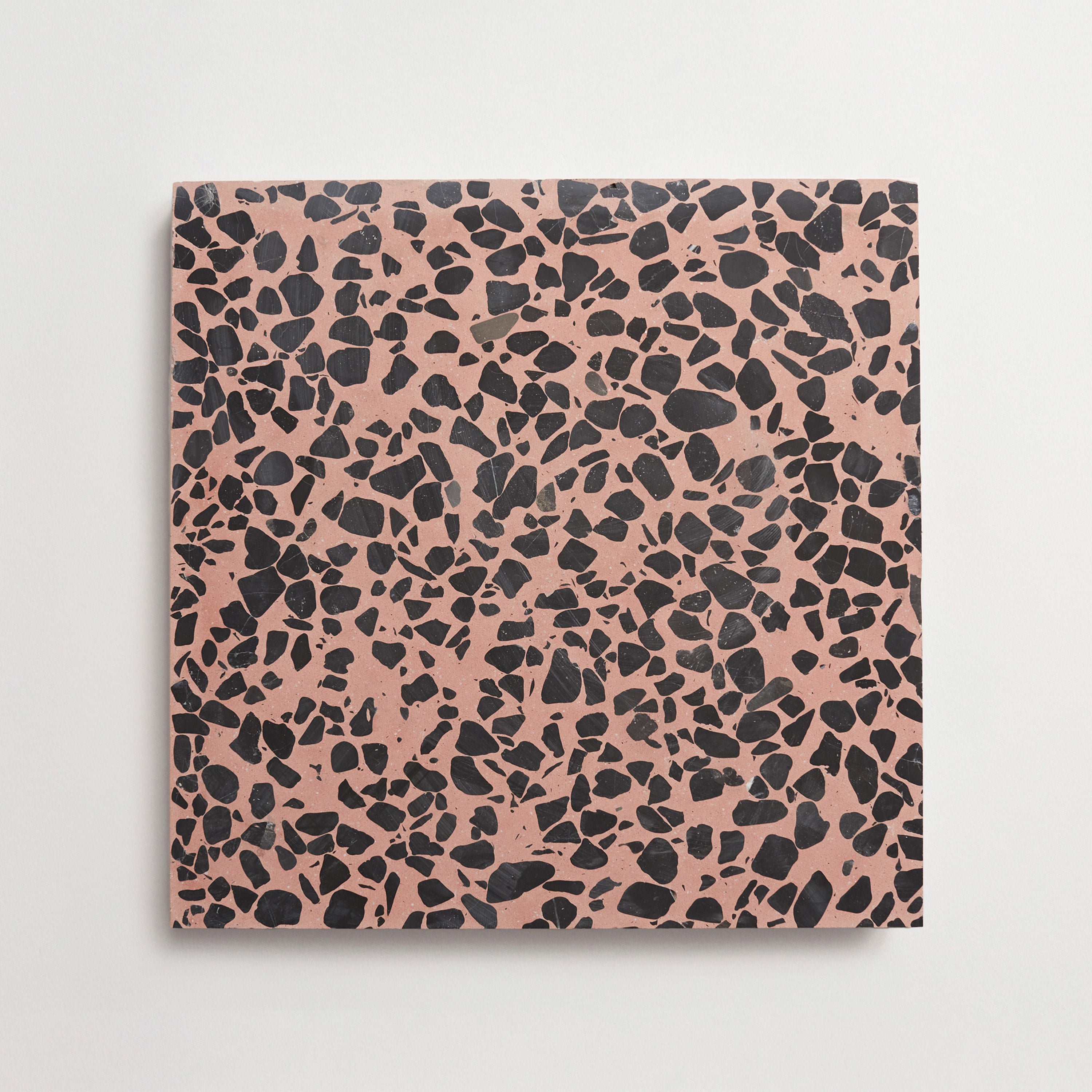
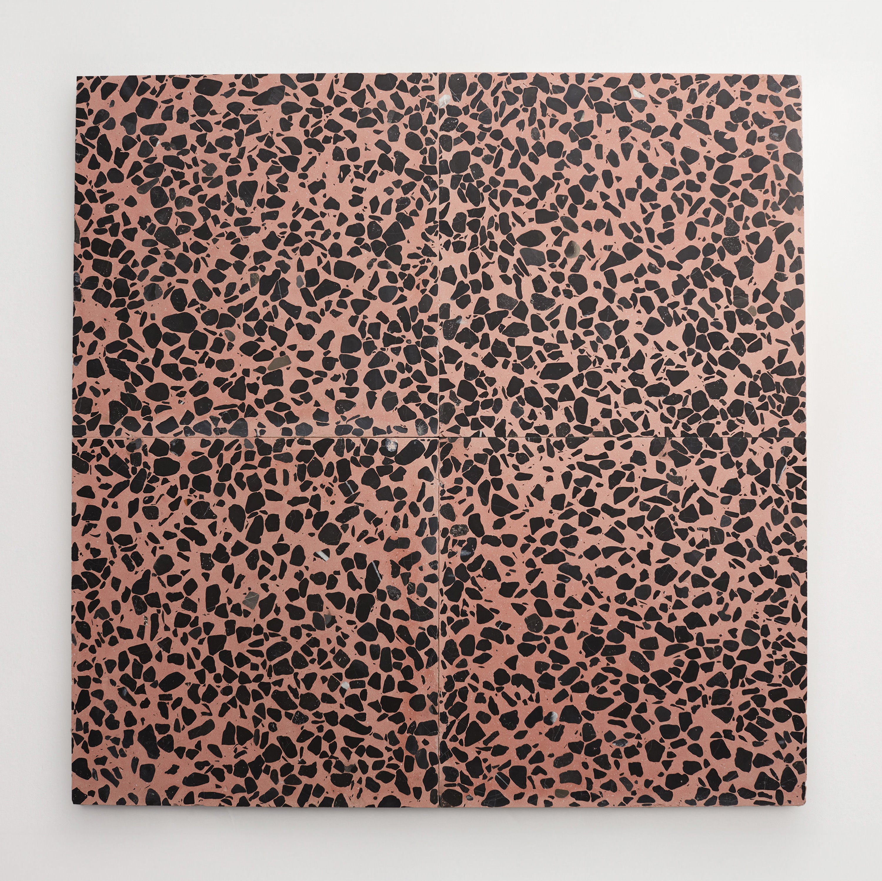

Colorway
-
Rosso
Collection
-
Dolce Vita Terrazzo
:
Sub Collection
-
Torrone I
Material
Length
-
8
" x
Width
-
8
" x
Thickness
-
⅞
"
Unit of Measurement
-
sqft
/
Price per Unit
$


Colorway
-
Royal Paisley
Collection
-
Lido
:
Sub Collection
-
Acquiterre
Material
Length
-
4
" x
Width
-
16
" x
Thickness
-
¾
"
Unit of Measurement
-
sqft
/
Price per Unit
$