
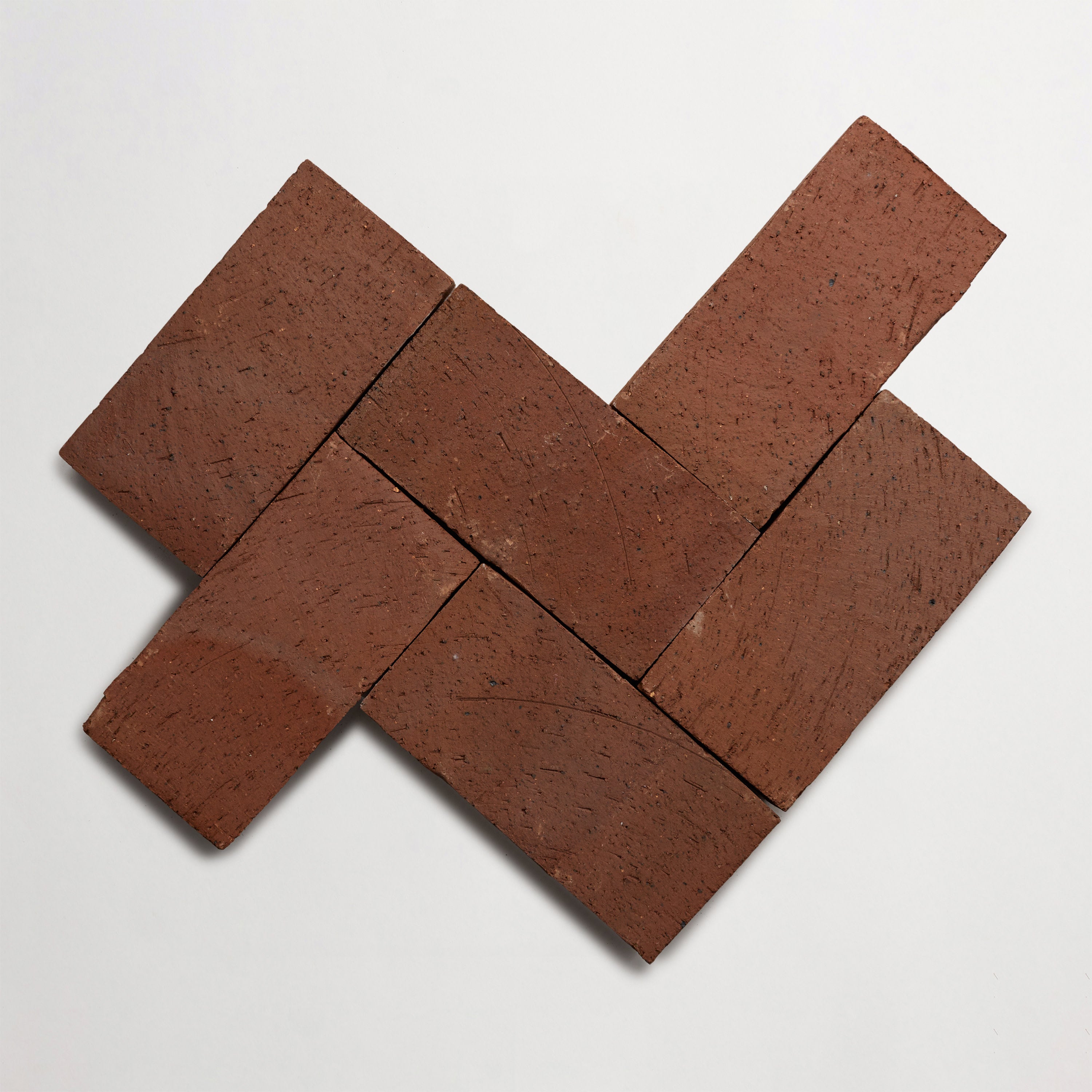
Dzek + Formafantasma: ExCinere, 2x8" Cigar, Terra A, Gloss. Photo courtesy of French & Tye.
9 Beautiful Outdoor Patio Color Schemes from Around the Globe
Outdoor patios are the ultimate canvas for landscape architects and interior designers who are looking to blend functionality with artistry. Whether specifying outdoor flooring for a resort, a restaurant courtyard, or a private residential project, selecting the right color palette is critical.
Because we love sourcing inspiration all over the world, we’re sharing nine globally inspired color schemes for outdoor patios. Each one showcases how artisan tile can anchor a design narrative, from the sun-soaked shores of the Mediterranean to the serene gardens of Japan.
Transform your outdoor space with artisan tile as your design foundation.

Riad in Marrakesh, Morocco. Photo courtesy of Toa Heftiba.

Grass house in Hemsedal, Norway. Photo courtesy of Ylli Gashi.

A villa with traditional arched details. Photo courtesy of Sai Kalyan Achanta.
9 Globally-Inspired Color Schemes for Outdoor Patios
Landscape architects and interior designers face the challenge of creating outdoor patios that are both functional and visually inspiring. Drawing on traditions from across the globe, these ideas underscore how artisan tile can serve as the foundation for an evocative outdoor palette. Whether your client favors the neutral tones found in Scandinavian spaces or the bold hues of a Moroccan courtyard, there’s a color scheme here that offers a distinct narrative.
1. Mediterranean Warmth with Terracotta & Cobalt
Capture the warmth of sun-drenched villas with a blend of terracotta earth tones and vibrant cobalt accents. Terracotta tile flooring can provide a durable, weather-resistant foundation, while glazed cobalt tiles can add bold color accents that evoke the deep blue of the Mediterranean Sea.
Harmonious color combinations of warm and cool tones help balance heat retention and visual comfort — essential when designing for afternoon sunlight. Furniture and decor can lean into natural elements, as well. Think: wrought-iron seating with cushions in neutral tones that allow the colors of the tile to shine.
2. Moroccan Jewel Tones in Emerald, Ruby & Sapphire
Moroccan design is famous for its intricate patterns and rich, saturated hues. A patio color scheme featuring emerald, ruby, and sapphire tiles will create an immersive, jewel-like experience. Mixed-format tile patterns, in particular — such as zellige mosaics — offer endless patio color combinations that play with color contrast and light.
Incorporating natural elements like clay planters and woven textiles can bring in harmonizing earth tones, while vibrant hues infuse the space with energy. This palette is ideal for projects that aim to make a bold statement.
3. Scandinavian Neutrals in Soft Grays & Off Whites
For a color scheme that prioritizes minimalism and calm, Scandinavian-inspired neutrals offer a timeless solution. Soft grays and off-whites on porcelain or matte-finish tile evoke the clean lines of Nordic design, creating an outdoor color palette that feels expansive and light.
Neutral tones encourage clients to focus on texture — such as natural travertine pavers or dark brick accents — rather than on bold colors. This approach is perfect for serene rooftop terraces or contemplative garden courts where the mood you want to evoke is tranquility and understated elegance.

A rock garden in Kyoto, Japan. Photo courtesy of Martti Salmi.
4. Japanese Serenity with Charcoal, Sand & Forest Green
Japanese gardens emphasize balance, harmony, and connection to nature. A color story of charcoal, sand, and forest-green tiles can translate this philosophy into a patio setting. Charcoal porcelain tiles form a sleek contrast to sand-colored mosaics, while forest-green accents echo foliage.
When selecting outdoor patio color schemes for a project, consider how these hues might respond to changing light. Morning sun brings out warm undertones in sand tiles, while evening shadows deepen charcoal’s drama. Including natural elements like bamboo seating and stone lanterns can enhance the color inspiration and create a cohesive sanctuary.
5. French Countryside with Lavender & Soft Earth Tones
The romance of Provence comes alive through lavender and muted earth-tone combinations. Lavender-colored encaustic cement tiles paired with soft-beige or taupe field tiles evoke rolling fields and weathered châteaux. This colorful patio idea manages to remain grounded and suits projects that seek to create a touch of rustic elegance.
Use color psychology to instill calm and warmth — lavender promotes relaxation, for example, while earth tones provide stability. Then, accent the scheme with wrought-iron tables and ceramic pottery to reinforce the pastoral vibe.
Explore our globally inspired collections to bring your color story to life.
6. Coastal Greek Palette with Crisp White & Turquoise
Whitewashed walls and ocean views define Greek coastal design. Crisp-white large-format tiles paired with turquoise mosaic borders can create an outdoor space that feels refreshing. For this reason, stark white and vibrant blue are two of the best outdoor colors for resort-style patios and pool surrounds.
To harmonize the space with the natural environment, select slip-resistant patio flooring finishes that complement the exterior walls. You can also tie the color scheme together with furniture and decor, such as white teak loungers and blue-striped cushions.

Château in Moustiers-Sainte-Marie, France. Photo courtesy of Qi Xin.

Minimalist hotel in Puerto Rico. Photo courtesy of Juan Burgos.
7. Tropical Rainforest with Lush Greens & Bright Accents
Invoke the lush energy of a tropical canopy by layering deep-grey slate or porcelain tiles with bright color accents. You might incorporate mosaic tile accents in sunshine yellow, fuchsia, or coral to mimic tropical blooms. This color scheme is an excellent choice for hotel courtyards or restaurant patios seeking vibrant hues that engage the senses.
Want to round out the entire look? Natural elements such as large-leaf planters, bamboo screens, and rattan furnishings can complement the palette while reinforcing the sense of being immersed in nature.
8. Latin American Inspired with Vibrant Oranges, Yellows & Colorful Patterns
Latin American design bursts with color, so this is the time to go all-out. Bold oranges and yellows in handcrafted terracotta or cement tile make for memorable exterior walls and patios. Patterned tiles with folkloric motifs can also introduce a festive spirit, perfect for cultural centers or artisanal cafes.
Remember to use color accents sparingly by balancing bold colors with neutral-tone field tiles. This approach to patio color will keep the space from overwhelming the eye and create an ambience that doesn’t sacrifice cohesion. You can also include vibrant hues in seating cushions or planters to tie the palette together.
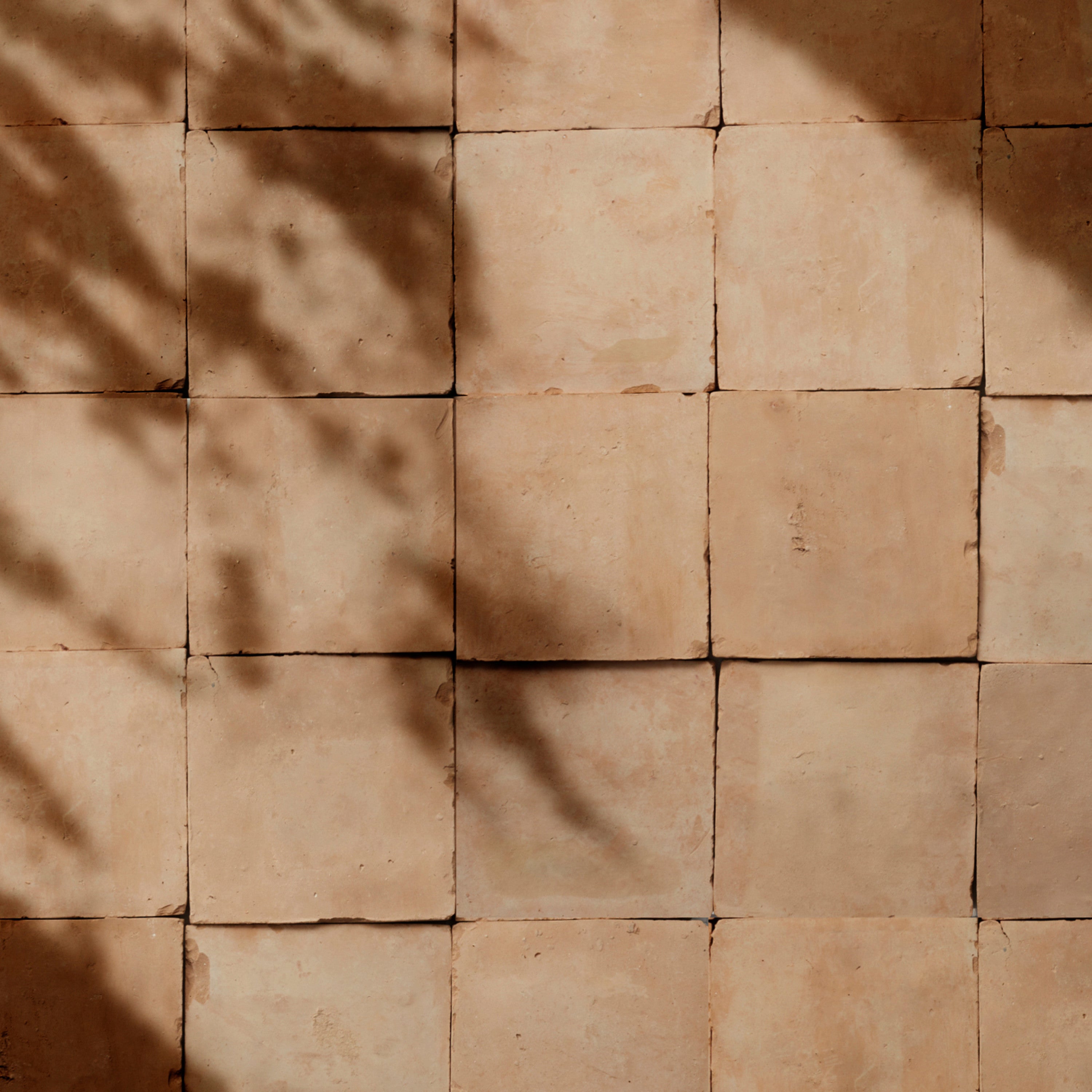
9. Desert Modern with Rust, Clay & Dusty Rose
Head to the intersection of desert modern and minimalism, and you’ll find warm, earthy tones. Rust-colored porcelain tiles, clay-hued mosaics, and dusty-rose travertine pavers reflect the shifting sands and adobe structures of arid landscapes. This outdoor color scheme suits high-end private residences, spa retreats, and gallery courtyards seeking a sophisticated yet organic aesthetic.
You might use earth tones to anchor the scheme, while subtle color contrasts in seating or sculptural planters can introduce visual interest. Think of the tile as the foundation: using large-format tiles reduces grout lines and enhances the sense of continuity across the patio flooring — including patio flooring installed over concrete.

House in Mallorca, Spain. Photo courtesy of Jannik.
Tips for Choosing Outdoor Patio Colors
Selecting an outdoor patio color scheme involves more than picking favorite hues. It requires understanding the project’s context, defining the atmosphere you want to create, and recognizing the pivotal role of tile as both material and color foundation.
The following tips will guide landscape architects and interior designers through creating harmonious, evocative, and enduring outdoor color palettes.
Harmonize with the Natural Environment
Before specifying tile colors, study the surrounding landscape, including existing flora, architectural style, and prevailing light conditions. A contextually responsive palette will feel organic rather than imposed. For example, desert environments benefit from warm rusts, terracotta, and sandy neutrals that echo local geology, while coastal sites call for crisp whites, aqua blues, and driftwood grays reminiscent of sea and sky.
Incorporating materials that mirror nearby stone, wood, and vegetation can help create seamless transitions between the indoor and outdoor zones. Integrating context-driven tile color schemes also ensures that the project feels rooted in place and reinforces a sense of harmony across every surface.
Consider the Mood You Want to Evoke
Color psychology is a powerful tool in shaping emotional responses to outdoor environments. Research suggests that warm hues like terracotta, rust, and sun-bleached gold create inviting, energetic atmospheres that are perfect for lively gathering spaces. Meanwhile, cool tones like slate blue, forest green, and soft gray promote serenity and contemplation in more reserved settings.
Blending warm and cool tones in a strategic way can guide circulation and define distinct zones within a patio. When specifying tile, evaluate how textures and finishes interact with color to heighten mood. Glazed surfaces amplify brightness, for instance, while matte finishes lend a subtle, introspective quality.
Set the Tone with Tile as the Foundation
Tile selection really lays the groundwork for a cohesive outdoor patio color palette. Material choice — be it porcelain, terracotta, cement, or natural stone — dictates durability, maintenance, and how color weathers over time. Large-format tiles with minimal grout lines tend to emphasize continuity and modern minimalism, while smaller-format mosaics encourage intricate patterning and vibrant color accents.
Consider tile finish, as well: matte surfaces reduce glare under direct sunlight, whereas polished or glazed tiles intensify color saturation. Strategic palette planning around a core tile selection simplifies furniture and decor coordination, as well, framing seating areas, planters, and outdoor kitchens in a unified visual language that supports both aesthetic goals and functional requirements.
Whether you’re drawing from Mediterranean warmth, Japanese serenity, or desert modern minimalism, a well-conceived outdoor patio color palette transforms any project. Artisan tile brings color inspiration, natural elements, and lasting beauty together, enabling designers to craft spaces that captivate and endure. Browse our curated collections to find the perfect palette for your project.


Colorway
-
Icy Fjord
Collection
-
Lido
:
Sub Collection
-
Acquiterre
Material
Length
-
4
" x
Width
-
4
" x
Thickness
-
⅛
"
Unit of Measurement
-
sqft
/
Price per Unit
$

Colorway
-
Natural (Unglazed)
Collection
-
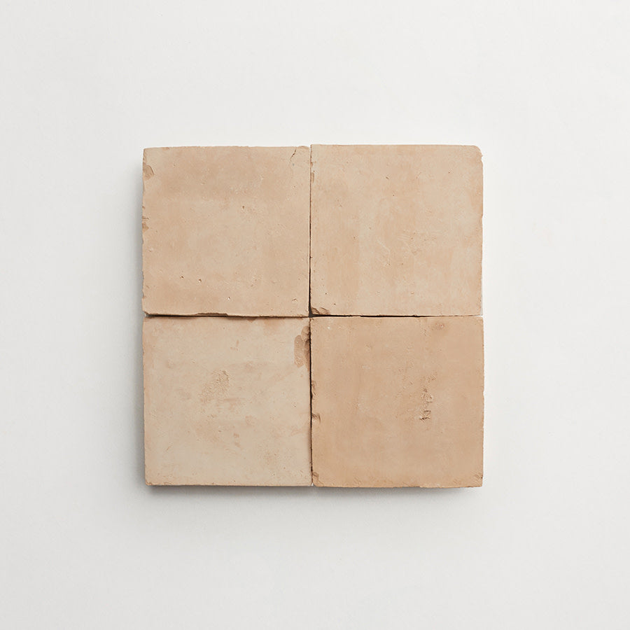
FezBrick
:
Sub Collection
-
Torrone II
Material
Length
-
8
" x
Width
-
8
" x
Thickness
-
⅞
"
Unit of Measurement
-
sqft
/
Price per Unit
$

Colorway
-
Denali Stone
Collection
-
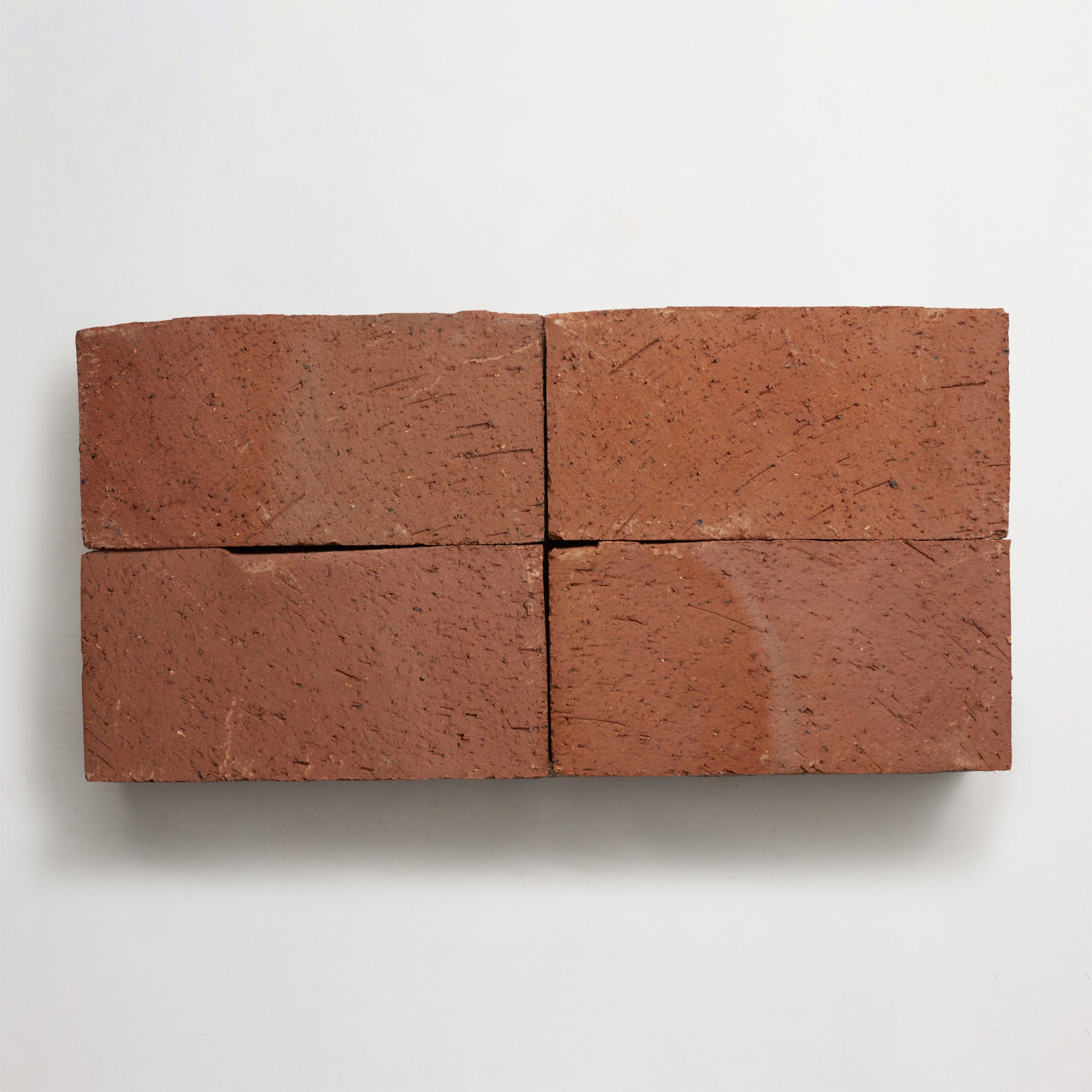
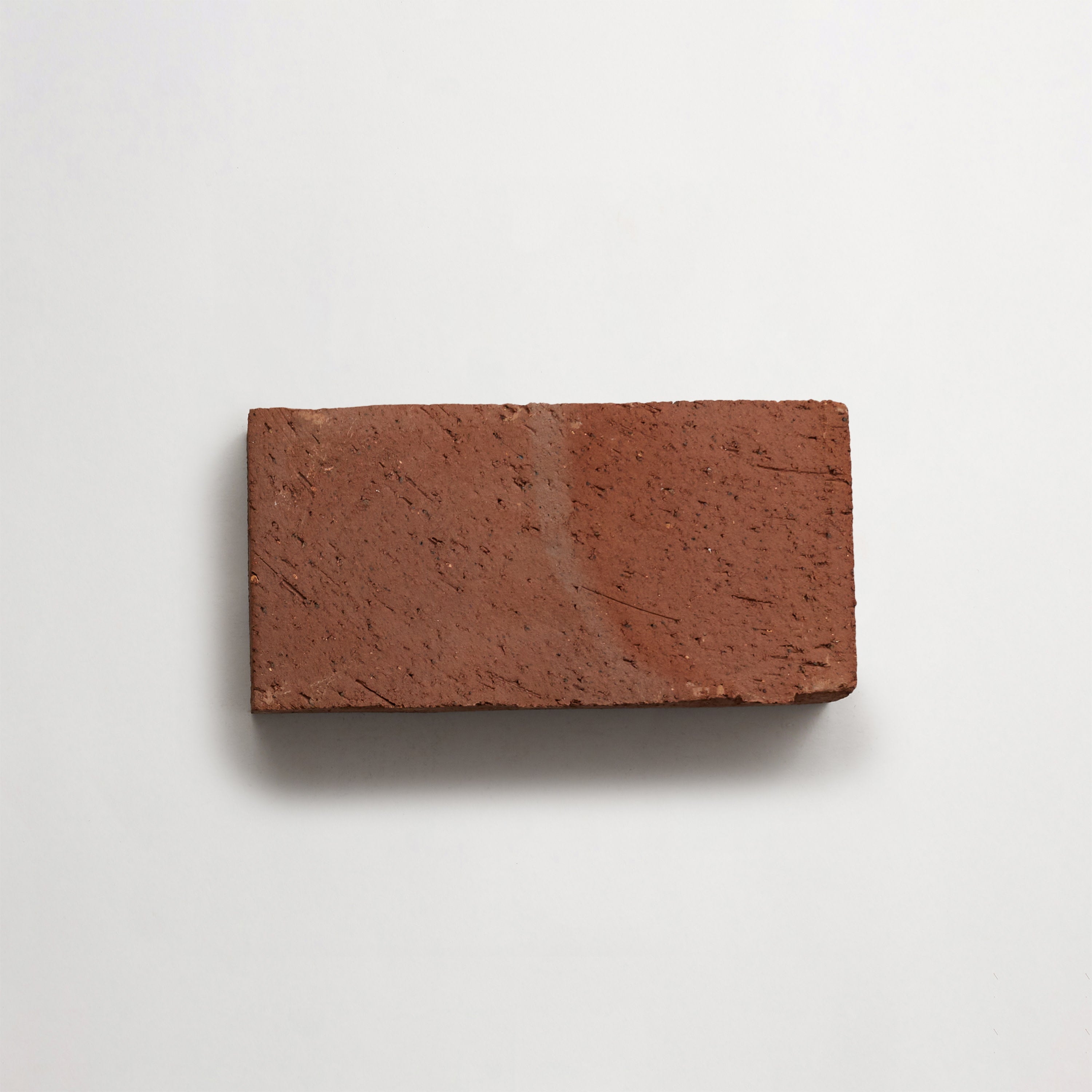
BrickWorks
:
Material
Length
-
4
" x
Width
-
16
" x
Thickness
-
⅝
"
Unit of Measurement
-
sqft
/
Price per Unit
$